


Branding and Communications Guide
Branding and Communications Guide
This guide gives teams an overview of the branding options available when preparing an Ideanote workspace for innovation campaigns.
Branding in Ideanote works at two levels: workspace branding and campaign branding. Workspace branding defines the overall environment. Campaign branding defines how individual idea collections, launch communications, emails, widgets, and follow-up materials appear to participants.
The goal is to make the experience recognizable, official, and easy to use.
Recommended Launch Checklist
Prepare the following assets before launch:
- Workspace logo: Square PNG or SVG. Use a simple version without small text.
- Workspace cover image: 2000 × 300 px. Keep important content centered.
- Idea collection cover image: 2000 × 500 px. Use one consistent campaign template.
- Shared link OG Graph preview image: PNG or JPEG. Use minimal text and a clear central visual.
- Campaign email header: PNG or JPEG. Useful for launch and reminder emails.
- Thank-you image: PNG or JPEG. Optional for submission confirmation emails.
- Brand colors: HEX codes for primary, accent, link, success, warning, and error.
- Font files: Licensed web font files, only needed when custom fonts are required.
Before launching a new workspace, confirm the workspace-level foundation: name, description, logo, theme preset, colors, avatar style, typography, layout style, login screen, email footer, custom domain, site metadata, and integrations.
Then prepare the campaign-level setup: section structure, idea collection names, campaign questions, descriptions, cover images, forms, phases, sharing method, widget setup, launch email, reminder email, thank-you message, success screen, results update, and success story format.
Workspace Branding
Workspace branding applies across the whole workspace. It includes the workspace name, logo, theme, colors, typography, login screen, email footer, custom domain, and shared link previews.
Workspace Name, Logo, and Brand
Where to find it: Settings → Workspace
The workspace name can represent the organization, department, innovation program, or broader initiative. Keep it short and recognizable, such as Innovation Hub, Ideas Portal, Continuous Improvement Platform, or Digital Ideas Lab.
The workspace description should explain the purpose in one simple sentence. E.g. “Share, develop, and prioritize ideas that help us improve how we work, serve customers, and create better outcomes.”
Use a simple workspace logo that works at small sizes. A square PNG or SVG with a transparent background is usually best.
Theme and Visual Style
Where to find it: Settings → Theme
The theme controls the overall look and feel of the workspace. Theme options include preset themes, color modes, colors, user avatars, headlines, text, buttons, layout, borders, roundness, and custom fonts.
Preset themes are useful as a starting point. From there, adjust the colors, typography, and layout to match the organization’s brand.
For most corporate launches, light mode is a safe default. Dark mode can work if it matches the brand. High contrast mode should be checked when accessibility is important.
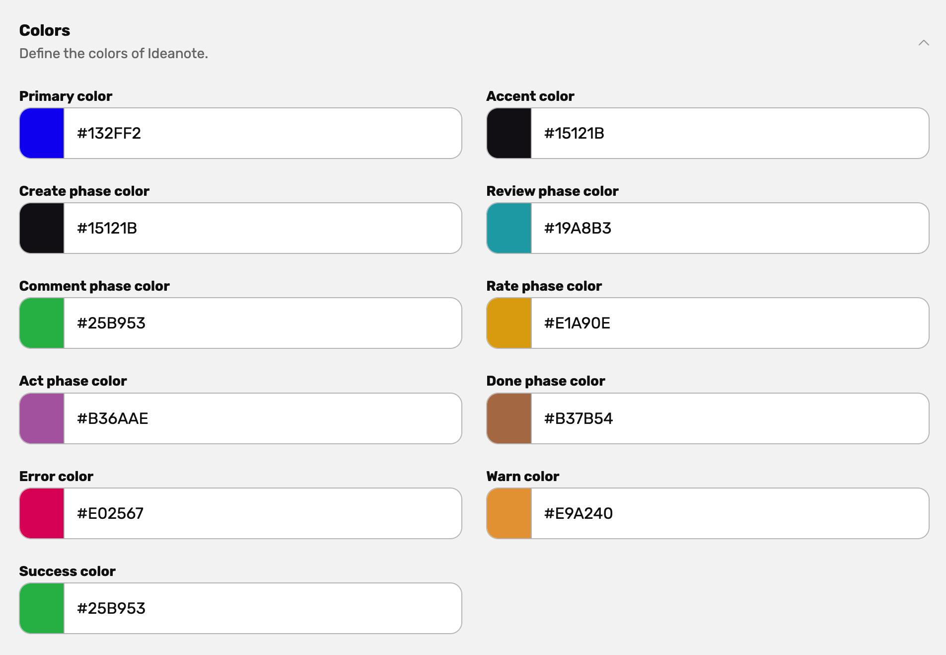
Colors
Where to find it: Settings → Theme → Colors
Use the organization’s primary brand color as the main workspace color where possible. Accent and link colors can either match the primary color or use a supporting brand color.
The color setup can include primary color, accent color, link color, phase colors, and system colors such as success, warning, and error.
Keep system colors close to common expectations: green for success, amber or yellow for warning, and red for errors.
Phase colors can help distinguish steps in the idea process, such as create, review, comment, rate, act, and done. Use separate colors only when they make the process easier to understand.
Typography, Buttons, and Layout
Where to find it: Settings → Theme
Typography settings can be adjusted for headlines, body text, and buttons. Use brand fonts only when they are licensed for web use and remain readable across devices.
Layout settings, borders, and roundness shape the overall feel of the workspace. Moderate roundness usually works well for a modern corporate workspace, while sharper corners can feel more formal.
User Avatars
Where to find it: Settings → Theme → User Avatars
Avatar style affects placeholder avatars for new users. Neutral or modern styles usually work best for corporate environments. More playful styles can work for creative campaigns, but should be used with care for formal or executive-facing initiatives.
Custom Fonts
Where to find it: Settings → Theme → Custom Fonts
Custom fonts can be uploaded when brand consistency is important. Before using custom fonts, confirm that the license allows web use, the font supports the required languages, and the font remains readable at small sizes.
Login Screen
Where to find it: Settings → Workspace
The login screen is often the first branded touchpoint. Relevant elements include workspace name, description, company name, logo, cover image, and theme colors.
The login screen should make the workspace feel official and quickly explain what users are entering.
Example:
Welcome to our innovation workspace. Share ideas, improve the way we work, and help shape what we build next.
Email Branding
Where to find it: Settings → Workspace → Email Customization
Workspace email branding helps participants recognize invitations and notifications. Depending on the setup, this can include footer branding, workspace logo, workspace name, and related email presentation settings.
Use a simple square logo that works at small sizes. Keep email branding clear and lightweight.
Custom Domain
Where to find it: Settings → Workspace → Custom Domain
A custom domain can make the workspace feel like part of the organization’s digital environment.
Example:
ideas.company.com
This is especially useful for company-wide launches, intranet links, Microsoft Teams announcements, and campaigns where trust and recognition matter.
Site Metadata and Shared Link Previews
Where to find it: Settings → Workspace
Site metadata controls how workspace links appear when shared in tools such as Microsoft Teams, internal chat, intranet pages, or social platforms.
Use a clear title, short description, and simple preview image. The preview image should have a central visual, strong contrast, and minimal text.
Integrations
Where to find it: Settings → Integrations
Integrations are not visual branding, but they affect how participants experience the rollout. Microsoft Teams, API, Power Automate, Power BI, webhooks, and embedded experiences can all become part of the branded launch flow.
Campaign Branding
Campaign branding applies to specific idea collections, sections, widgets, emails, and communication materials.
Use campaign branding when different initiatives need their own identity while still feeling connected to the same workspace. For example, sustainability, cost savings, customer experience, and digital transformation campaigns can each have a distinct visual style while sharing the same workspace theme.
Sections
Sections help organize related idea collections across the workspace. They can represent departments, strategic themes, regions, programs, or campaign categories.
Examples: Sustainability, Customer Experience, Operational Excellence, Digital Transformation, Product Ideas, Employee Engagement.
Idea Collection Branding
Where to find it: Go to the Idea Collection → Edit
Each idea collection can have its own title, question, description, cover image, form, phases, settings, and sharing options.
The title should be short and specific. The question should make the ask clear. The description should explain the context, what kind of ideas are useful, and what will happen next.
Idea collection cover images help participants distinguish campaigns at a glance. The recommended format is 2000 px wide × 500 px high. Keep important content centered, since cover images may crop differently depending on screen size and layout.
A simple visual system can make campaigns easier to recognize. E.g. a color tint for each section, e.g. blue for global campaigns, orange for local campaigns.
Forms, Phases, and Process Language
Where to find it: Go to the Idea Collection → Edit
Campaign branding is also shaped by language. The form, phases, statuses, and calls to action should match the campaign’s purpose.
Use simple wording. Make it clear whether participants should share only well-developed proposals, early thoughts, small improvements, bold ideas, or all of the above.
Phase names should help people understand the process. Examples: Submit, Review, Prioritize, Develop, Selected, Implemented.
Sharing, Invitations, and Widgets
Where to find it: Go to the Idea Collection → Share
Campaigns can be shared through direct invitations, shareable links, and widgets.
Invitations work well when the audience is known. Shareable links are useful for intranet posts, Microsoft Teams messages, and broad internal communication. Widgets are useful when the campaign should be embedded into another page or portal.
Widgets can also support campaign-specific branding. Depending on the setup, the welcome page, form page, success page, images, title, description, buttons, and submission flow can be adjusted.
Campaign Communications
Strong campaign communication helps participants understand why the campaign exists, what to contribute, and what happens after they submit an idea.
As a best practice, every campaign should have a simple communication plan before launch. The plan does not need to be complex, but it should cover the key touchpoints: launch, reminder, submission follow-up, and results.
1. Launch Communication
The launch message should explain the purpose of the campaign, why it matters now, who is invited, and what kind of ideas people are expected to share.
This is where the campaign should answer questions like:
Are we looking for small improvements, big ideas, practical fixes, bold proposals, customer insights, cost-saving ideas, or all useful ideas? Should ideas be fully developed, or are early thoughts welcome?
A good launch message makes participation feel simple and relevant.
2. Reminder Communication
Reminders should reinforce the campaign purpose and make the ask easier to act on. Instead of only saying “submit your idea,” include examples of useful ideas or common starting points.
For example: “Think about repeated frustrations, wasted time, customer pain points, manual work, safety concerns, or improvements your team already talks about.”
Use reminders sparingly, but make them helpful.
3. Submission Follow-Up
After a participant submits an idea, the success screen or confirmation message should explain what happens next.
A simple three-step format works well:
- First, your idea will be reviewed.
- Then, selected ideas will receive feedback or move to evaluation.
- Finally, in 60 days we will share which ideas move forward
For open and collaborative campaigns, explain how participants can receive likes, comments, or feedback from colleagues.
For closed campaigns, explain that ideas will be evaluated by a panel or selected group, and that participants will receive an update once the review is complete.
The important part is transparency. Participants should not feel like their idea disappeared after submission.
4. Results and Success Stories
Every campaign should close the feedback loop.
- For one-off campaigns, share which ideas were selected, what happens next, and later which ideas reached implementation.
- For continuous campaigns, create a recurring feedback loop with updates on reviewed ideas, selected ideas, implemented ideas, and lessons learned.
Success stories can be branded as part of the campaign or corporate communications. They can be shared through email, Microsoft Teams, intranet posts, town halls, workspace updates, or internal newsletters.
A strong feedback loop helps participants see that ideas are taken seriously. It also makes future campaigns easier to launch.
Custom Campaign Emails
Where to find it: Idea Collection → Edit → Automations, or Settings → Automations
Custom emails can be used to invite, remind, thank, update, and re-engage participants based on the campaign flow.
Useful campaign emails include launch announcement, reminder, submission confirmation, voting open, idea moved forward, idea selected, idea not selected, milestone reached, winner announced, and results shared.
Keep emails short and action-oriented. Use the campaign name, a clear reason for the message, and one primary next step.
Dynamic variables can personalize email content, such as the participant’s name, workspace name, idea title, collection name, or other relevant details.
Campaign Visual System
For larger rollouts, create a small set of reusable campaign assets before launch.
Useful assets include workspace cover image, idea collection cover image, campaign email header, thank-you image, Microsoft Teams announcement image, intranet banner, presentation slide, and shared link preview image.
A good visual system does not need many assets. It needs consistency: one core style, 3–6 approved colors, one cover image format, one email header format, and a simple rule for icons or illustrations.
Final Guidance
The best branding is recognizable, simple, and repeatable.
Focus on clear naming, readable colors, consistent cover images, short campaign emails, useful success screens, and regular updates that close the feedback loop.
A good campaign should make participants feel: this is official, I know what kind of ideas to share, and I understand what happens next.