

Custom Charts And Segmentation For Idea Analytics
Create bar, line, pie, map and funnel charts. Segment by team, owner, time, ratings and track growth with clear visuals.
How Do You Track Where Your Ideas Stand Right Now?
Your innovation portfolio grows every week. New ideas come in. Teams move work forward. Ratings get added. You need to see what matters to your organization right now, not scroll through everything.
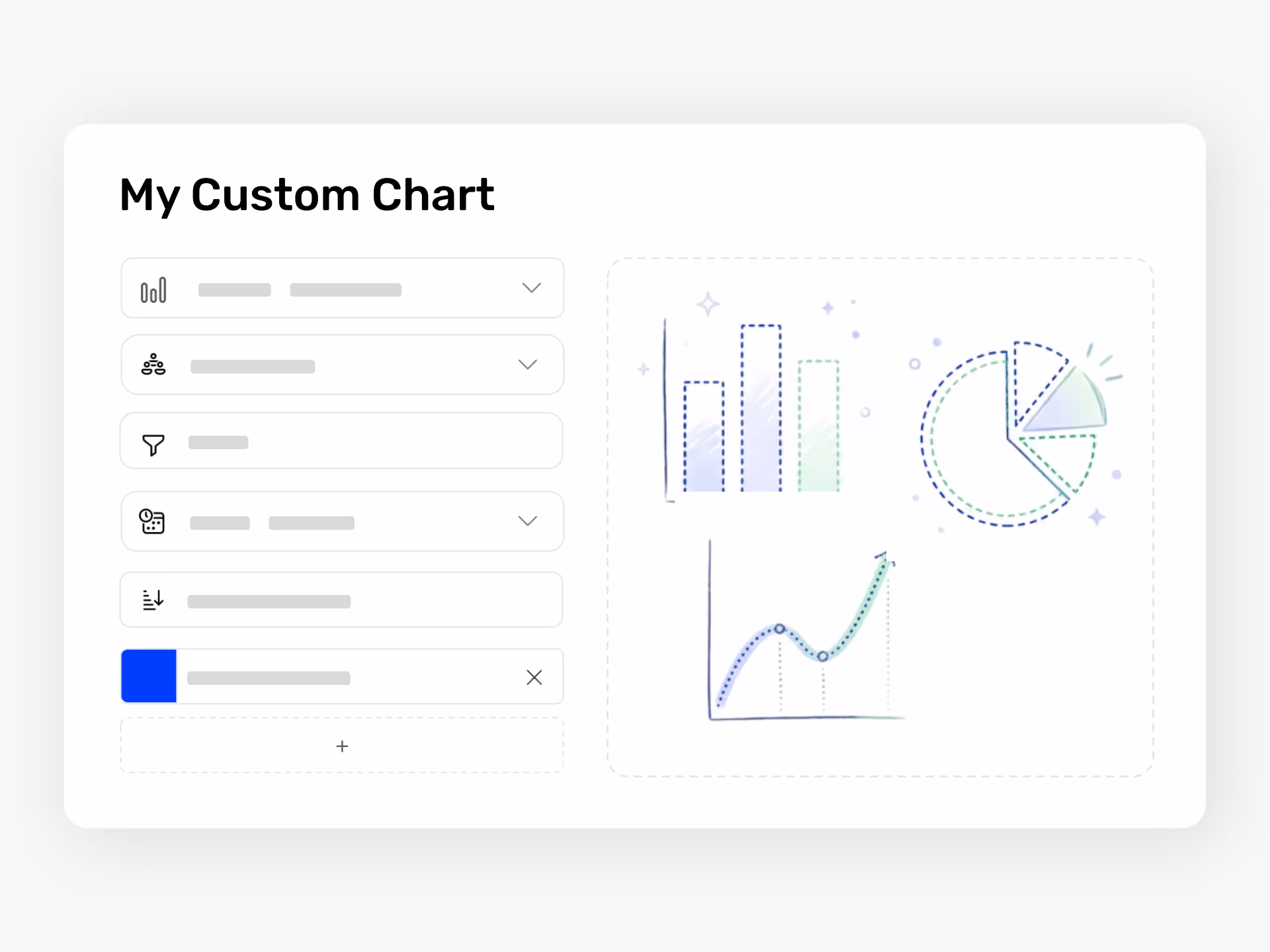
Ideanote lets you build the exact charts your team needs. Choose from bar, line, pie, funnel, radar, XY plot, map, list, scorecard, and word frequency charts. Each one shows your idea data the way you need to see it.
Filter your view by the metrics you care about. Look at ideas with high impact ratings and low cost. Show only ideas in the evaluation phase. View submissions from a specific department or team. See ideas that still need action from an owner.
Segment Your Data by Team, Time, and Ratings
Break down your idea pipeline by team, department, or goal. Track how many ideas moved through each phase this quarter. Compare participation across locations. See average ratings across different collections.
Set the time frame you need. Look at the last quarter, the last month, or the full year. Track growth over time. Calculate totals, averages, or other aggregations.
Export your charts to spreadsheets or Power BI when you need to share reports outside the platform. Build dashboards that show exactly where your ideas stand and where your team should focus next.
How do I build custom reports and dashboards in Ideanote?
You build custom charts by selecting from multiple chart types like bar, line, pie, funnel, XY plot, radar, scorecard, map, list, and word frequency charts. You choose your data category (ideas, collections, comments, users, teams, or likes) and apply filters based on ratings, owner, time frame, or status.
Once you create a chart, you add it to your dashboard. You control what gets displayed and how the data gets sliced. All charts update automatically as new ideas and activity flow through your workspace.
Can I filter ideas by team, department, or owner?
Yes. You segment your idea data by the owner's department, the team the owner belongs to, the idea's assigned owner, and the status or phase of the idea. You apply these segments when building any chart type.
This means you view all ideas from a specific team, see which phase each department's ideas are in, or track how many ideas each owner manages. You combine these segments with time filters to see activity within a specific period.
Can I track idea progress and engagement over time?
Yes. You set time frames (like the last quarter or year) and build line charts or bar charts showing trends. You track metrics like the number of ideas submitted, comment activity, likes, or how ideas move through different phases.
You also use growth calculations to measure change over time. This shows whether participation increases, how your idea pipeline develops, or if engagement improves across different teams or collections.
Can I sort and filter ideas based on ratings or scoring?
Yes. You filter ideas by their average rating and sort by rating scores when building charts. For example, you create a view showing only ideas with high impact ratings or ideas rated low on cost.
You combine rating filters with other segments. This lets you see high-rated ideas from a specific team or track which phase your top-scoring ideas are in.
Can I see a consolidated view of ideas across multiple collections or phases?
Yes. You build charts that pull data from multiple idea collections at once. You segment by status or phase to see how many ideas sit in each stage across your entire workspace.
You create funnel charts to visualize your idea pipeline or bar charts that compare phase distribution across different teams or departments. This gives you a single view of your portfolio without opening each collection separately.
Can I export chart data or connect to external BI tools?
You export your idea data and analytics to spreadsheet formats for external analysis or reporting. This includes raw data behind your charts so you do further work in Excel or other tools.
You also connect Ideanote to Power BI and similar business intelligence platforms. This lets you combine idea data with other company data sources or build more advanced reports outside the platform.
What data categories are available for charting?
You build charts from ideas, idea collections, comments, form entries, users, teams, likes, and device data. Each category gives you different metrics and filtering options.
For example, charting ideas lets you filter by ratings, owner properties, and field values. Charting users or teams lets you track participation and engagement by group. You choose the category that matches what you want to measure.
Can I create multiple dashboards for different audiences or purposes?
Yes. You create as many dashboards as you need. You build separate dashboards for executive summaries, department-level views, or project-specific tracking.
Each dashboard holds different charts tailored to what that audience needs to see. Your leadership dashboard might show high-level engagement and pipeline metrics while a department dashboard focuses on their team's ideas and ratings.

Gestion d'idées intelligente et facile
Contactez nos Experts ou essayez Ideanote gratuitement. Aucune carte bancaire requise.